Attraction
Completed in 2018
User experience and user interface design, preparation of materials for development of iOS and Android mobile applications.
Task
To design the user interface of mobile application with recommendations, based on analysis of a photo shot of a face, and prepare all needed materials for developers and resources for the app store.
Idea
Andrey Iskornev (the founder of the Platinental plastic surgery clinic) developed an algorithm, which declared how many facial features were combined with each other, which differentiates from generally accepted beauty patterns. Based on the results of this algorithm, you can make decisions, for example, whether it is worth making the hairstyle longer or using less makeup under the eyes.
Usage cases
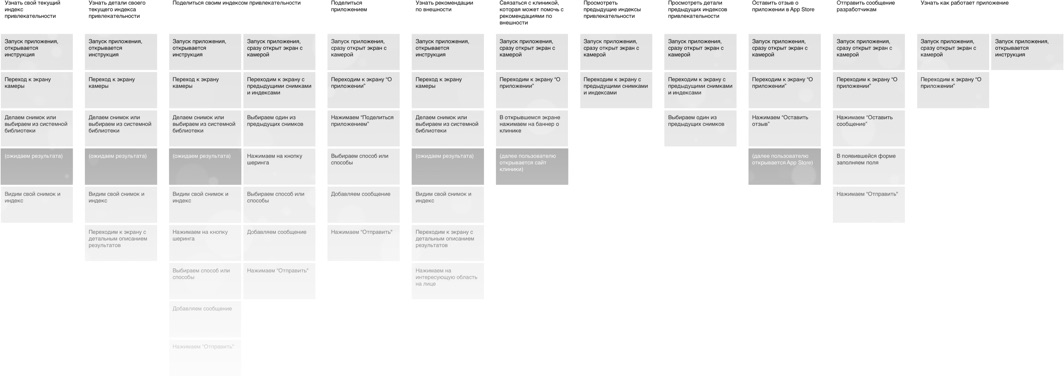
Together with the project team, we thought over the functionality and described the ways of using this functionality by a user. As the result, the table with user cases was composed.

Structure
In the next stage we have made the structure of the application, allowing to fit the described usage cases.

The structure of the application is a very approximate understanding of which function will be available on which screen. The next step we clarified the structure and detailed each screen application.
Final mockups
A schematic mockups serve as a base for the final mockups of the application interface. We decided what style to use and wrapped up the layout.
Onboarding
When a user launches the application for the first time, he sees the simple instruction that briefly explains how to use the application.

Main screen
Camera screen is the main screen of the application. Besides making a shot it helps making a correct framing, which ultimately affects the result of the analysis of the shot.

Analysis of a shot
The processing of a shot is not an instant phase. In order for the user to understand what is happening and not get bored during this process, each step is described.

Results
The result of the shot analysis is an index from 0 to 9.9. Also on this screen it is possible to share an index in social networks and get a detailed description of strengths and those that should be paid attention to.

After turning the smartphone to the landscape position, the screen focuses on the history of all the shots taken and analyzed.

Tips
There are also tips in the application on how to take a better shot, allowing to reach the most accurate analysis.

Errors
Things happens. and the application should respond accordingly to these situations. We prepared error messages telling what happened and how to solve this situation.

And other screens and their states...

Adaptation for Android
Since the application interface was not built on standard components, there was no strong attachment to the patterns of user behaviour on iOS. Consequently, the need to redraw the entire interface for Android did not arise, which helped speed up the delivery of the interface for developers. We have changed only dialog boxes.

Application development was carried out by the client.